I thought it would be good to have a Favicon for this site, so I made one. The results were, well, mixed. I used RealFavicon, which worked just fine. I did the design in Adobe Illustrator. Also fine. The real challenge, unsurprisingly, was not technology but design.
My first effort was nice-looking. In Illustrator. In big.

Font is spindly. Contrast is …
So, I pressed on. I started looking at other folks favicons, and I got the bright idea mine should be black & white.
This effort was plainer.

It’s square, which a good favicon should be. But, the font is really too spindly as well.
So, I thought I would make a “roundel”. I also enlarged the whole thing. Instead of 62 x 62, I went 300 x 300.
Probably, I was on the right track, but…
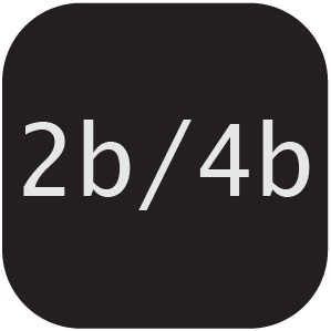
I had to get fancy. I made a “rounder roundel”, thinking it would be distinctive.
Favicon maker did warn me about the un-squareness. But, I thought the fat font would be an improvement.
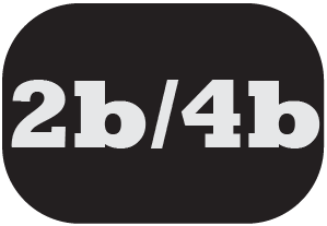
It still looks “puny” in the browser tab, though.

Well, it’s a start. I will choose to view it positively, and learn from the experience. Ya dig?